
The day
We were invited to Google Academy HQ for a 1 day Design Sprint, focusing specifically on mobile checkout.
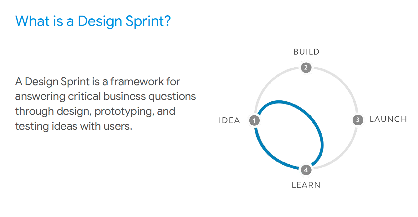
We spent the morning learning more about how Google structures a design sprint, and the process involved. This starts with Understanding and Defining the problem, Sketching ideas and then Deciding on one to focus on before Prototyping and Validating the results.
How Might We's
Crazy 8's |
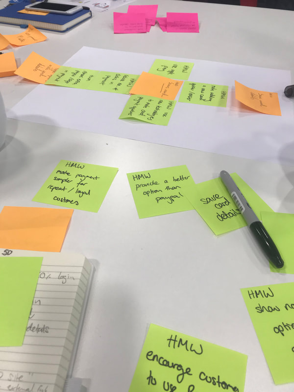
We started the day of creating 'How Might We's' on post it notes. These included things like, HWM...
Once we had all extinguished our ideas, we put them together in our group to see if we had any similarities and themes and then grouped these together. We found similarities in adding new tech payment methods (Apple Pay and Card Scanning) and increasing the users confidence in the payment security so we out these together. |
We did a round of Crazy 8's - where you have 1 minute to make a sketch of a potential idea from the previous round. This is done 8 times over 8 minutes, until you have a piece of paper filled with fresh ideas!
Prototyping
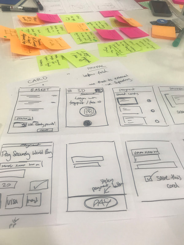
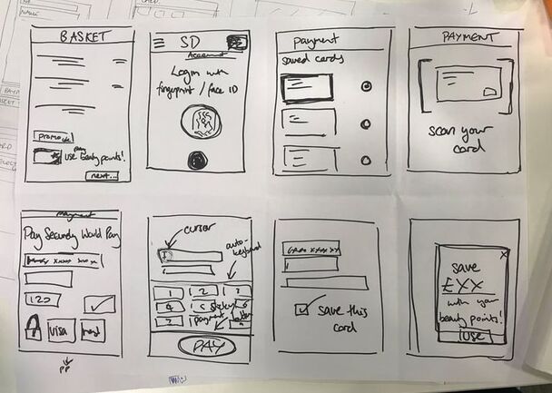
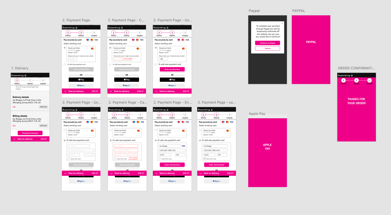
Once we knew our priorities, we mapped out user flow and started a paper prototype, showing what we would like on each page and step of the journey.
We chose to then mock up a low fidelity digital version in XD (as this was the quickest tool, and most commonly used amongst the group).
Due to time constraints, we decided to focus solely on the payment section, as this is also the highest problem area for Superdrug with a high drop-off.
We chose to then mock up a low fidelity digital version in XD (as this was the quickest tool, and most commonly used amongst the group).
Due to time constraints, we decided to focus solely on the payment section, as this is also the highest problem area for Superdrug with a high drop-off.
Our prototype focuses on prioritising Apple Pay over Paypal, ensuring this is above the fold and easy to select. We also added a progress bar so users can see how far they are in the checkout process - this is know to improve engagement as users feel fulfilled as they complete tasks. We also added a sticky subtotal at the bottom of the page, so the cost is always visible to the customer. They can also tap this to expand the summary of their basket total to view delivery costs, points earned, discounts and savings. Unlike the existing site, users have the option to save their card details when they enter a new card, or choose from a previously saved card.
User Testing
To test the prototype, we split up around the room, asking other people from other companies to test using our app.
We asked them to imagine that they had been shopping on the Superdrug website, and were completing their checkout up to the point of payment. We allowed the participants to navigate through the payment page, and we watched how they interacted with the prototype. We found that users managed to proceed to payment confirmation quicker than on the original, especially by using a saved card. The card layout also helped them fill in the relevant details quicker as they could easily identify which card numbers would go in which field. However, we realised it would be easier to show examples of data that needs to be entered into the form fields, and the name of the form field above the box instead. For Example: 16 Digit Card Number, e.g. 1234 5678 9012 3456
However, No users clicked on the basket summary, so we will consider revising this design to make it more obvious that it expands. We will also add a basket summary so customers can see their basket itemised. There is currently no option for Loyalty Card members to Pay with Points so we will consider how to make this possible without interfering with the payment methods. Customers would also like to see how to pay with Klarna or to add a new card by scanning it on thier phone.
Next Steps
As we didn't have much time on the day to add all the features to the prototype, we decided to focus on adding new features in the next steps. These will include the Scan Card feature and Pay with Points.
