
Before...
|
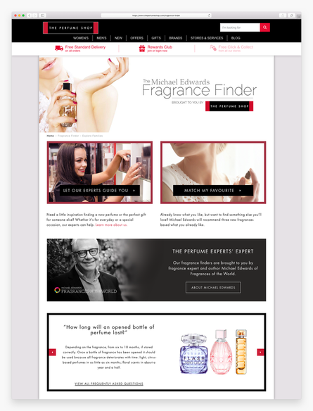
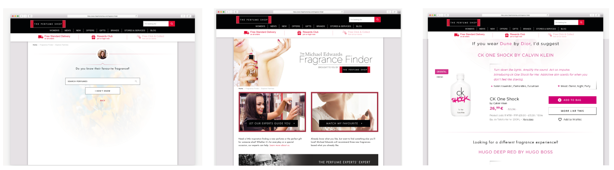
The Fragrance Finder is a tool designed to help users find new fragrances online, based on the scent they currently wear. However, conversion rate for users that use the tool has dropped by 75% compared to those who don't use it.
Found issues include - Confusion on where to navigate from the homepage - Old fashioned design and look & feel - Search query not working in quiz - Jumpy and glitchy to use on mobile - Too much information overload on results page - No clear CTA from results - Results not customer focused - top sellers / brands - Too much Fragrance Expert lingo that customers don’t understand Traffic by device: 65% mobile / 25% desktop / 10% tablet Avg session duration: 8.01 (vs +400% not using the tool) Conversion rate: 0.4% (vs -75% not using the tool) Avg Spend: £44.89 (vs -11% not using the tool) |
Customer Behaviour Research
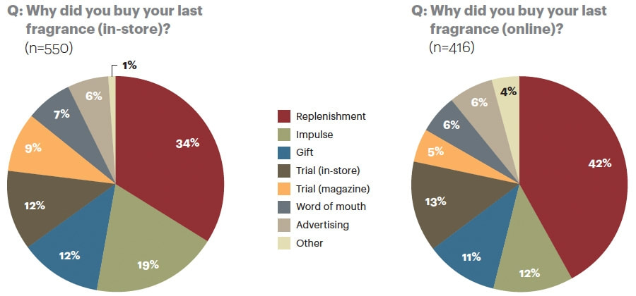
Encouraging consumers to buy new fragrances online has been a challenge for many years. People still want to smell and spray the perfume in store, before committing to a purchase. Nearly half of fragrances bought online are for replenishment, as the customer is already familiar with the smell of the fragrance. A much smaller percentage of customers are likely to impulse buy.
I ran some user research in the office to see what people thought of the quiz overall. 10 participants took the quiz and then completed a survey, rating different aspects of the quiz on a scale of 1-10, and also their likes/dislikes and what could be improved.
This research identified 5 key issues:
1. The experience is not optimised for mobile - the page jumps around and glitches as you search and navigate
2. Users struggle to identify with the language used to describe fragrances
e.g. A Sensual Evening. They want to see terms they understand like floral, fruity, musk...
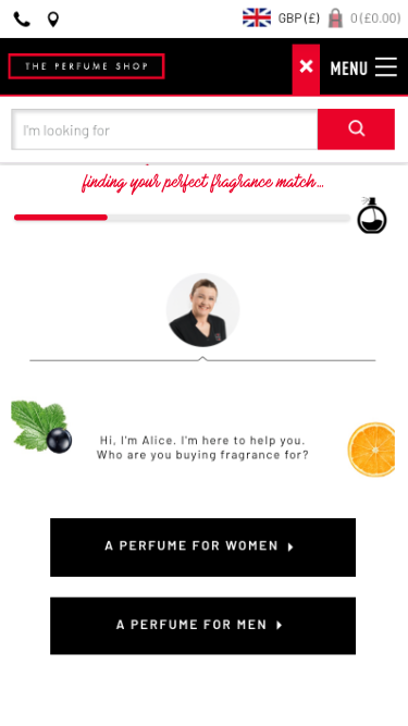
3. Customers did not understand the Match My Favourite concept, and how using their current fragrance helps match similar perfumes they might like.
4. The results are not relevant to the user - the user does not deem them similar to their current favourite, not in the price range or not similar brands
5. The recommendations were not recognisable - not well known fragrances that the customer may recognise and be tempted to purchase.
I ran some user research in the office to see what people thought of the quiz overall. 10 participants took the quiz and then completed a survey, rating different aspects of the quiz on a scale of 1-10, and also their likes/dislikes and what could be improved.
This research identified 5 key issues:
1. The experience is not optimised for mobile - the page jumps around and glitches as you search and navigate
2. Users struggle to identify with the language used to describe fragrances
e.g. A Sensual Evening. They want to see terms they understand like floral, fruity, musk...
3. Customers did not understand the Match My Favourite concept, and how using their current fragrance helps match similar perfumes they might like.
4. The results are not relevant to the user - the user does not deem them similar to their current favourite, not in the price range or not similar brands
5. The recommendations were not recognisable - not well known fragrances that the customer may recognise and be tempted to purchase.
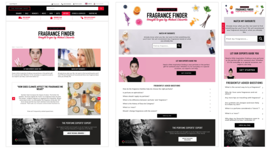
UX Review
From a UX perspective, there is a lot of wasted retail space on this page. The ‘Fragrance Finder brought to you by Michael Edwards’ banner is not click-able and yet takes up lots of valuable space above the fold.
|
|
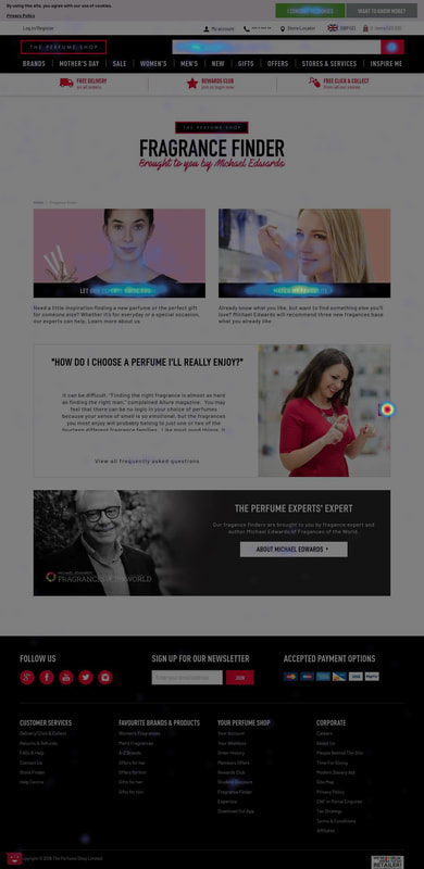
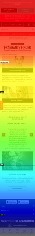
75% of mobile users scroll enough to see the both Quiz options. The images of the women used for the Quiz Covers don’t really relate to the quiz’s themselves and look like generic iStock images rather than The Perfume Shop staff. There is no time indication of how long this quiz will take... it could be 5 minutes or 20 seconds! No users were clicking on the Michael Edwards banner at the bottom of the page.
The Approach
I split the problem into 3 key areas to focus on: Quiz Questions, Landing Page and Results Page.
1. Search Algorithm
The data suggests that the fragrance search page had the highest exit and bounce rate, implying that customer were struggling with this part of the quiz. Therefore we set about to improve the suggestions in search functionality.
The ranking of search suggestions were ordered alphabetically by fragrance name, which meant that they were not necessarily in the order the customer would expect. For instance, if you search for “Dior” you would expect to see the top best-sellers, rather than the every Dior fragrance in existence ordered a-z, which often was the majority of the back-list.
The ranking of search suggestions were ordered alphabetically by fragrance name, which meant that they were not necessarily in the order the customer would expect. For instance, if you search for “Dior” you would expect to see the top best-sellers, rather than the every Dior fragrance in existence ordered a-z, which often was the majority of the back-list.
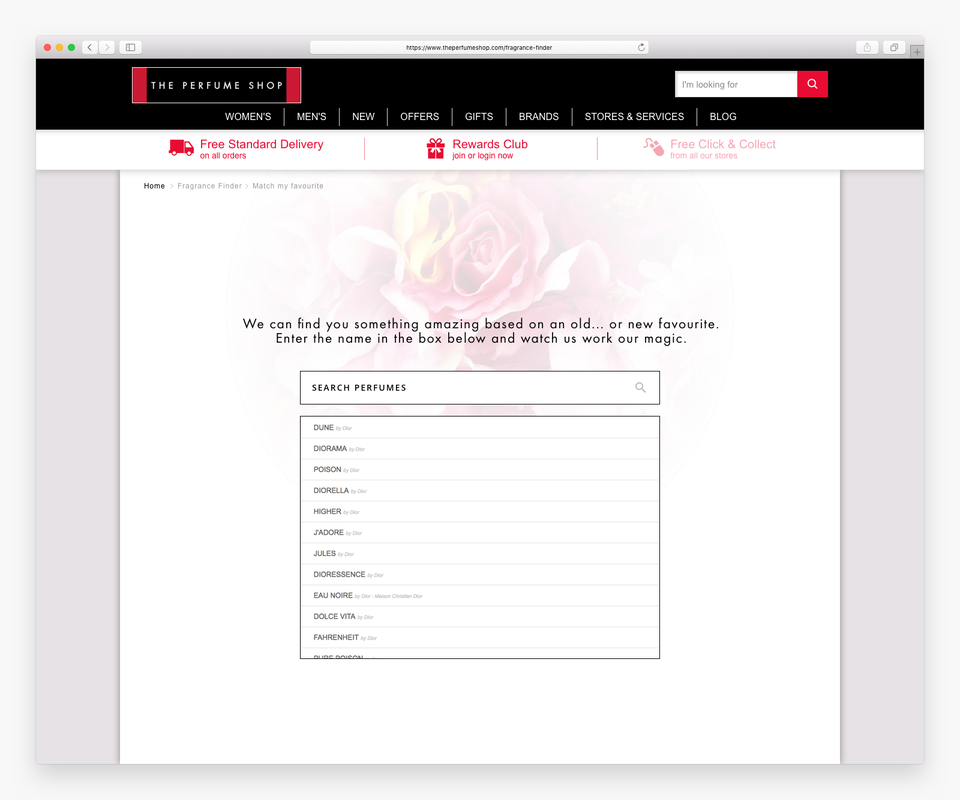
Instead, we worked with FOTW to re-order the search suggestions to align with the webshop. Rather than A-Z, the list is ranked by relevance and The Perfume Shop’s top 250 best sellers to make sure they are commercially minded.
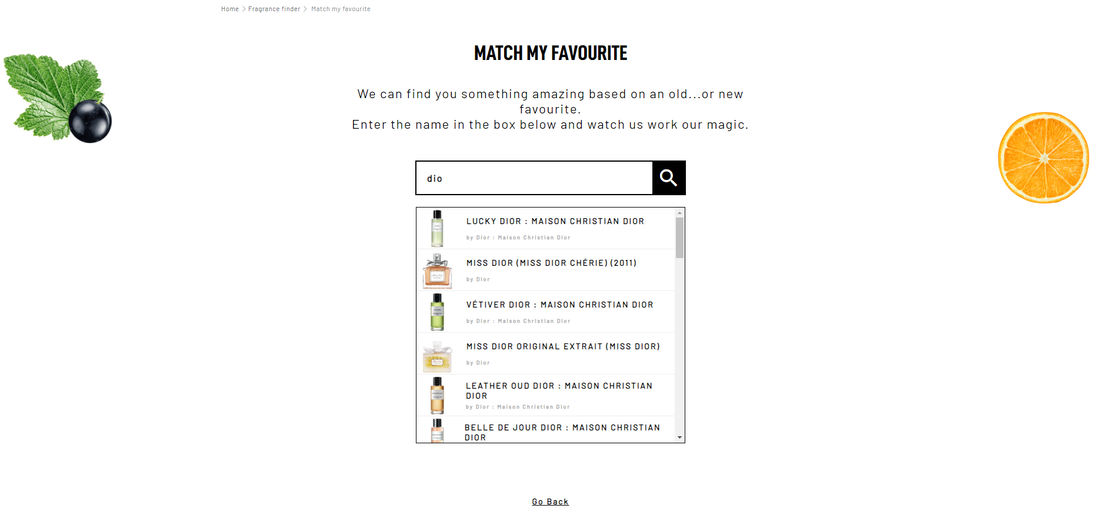
Customers also struggle to find their perfume based on the name alone and from our user research I realised that most people distinguish their perfume back on the bottle image. Therefore we added these into the search drop-down to help user’s identify their fragrances quicker. This would reduce the time taken to search, and help the user pick the right perfume that they currently own. Overall this aims to reduce drop off and increase the accuracy of the search results.
Customers also struggle to find their perfume based on the name alone and from our user research I realised that most people distinguish their perfume back on the bottle image. Therefore we added these into the search drop-down to help user’s identify their fragrances quicker. This would reduce the time taken to search, and help the user pick the right perfume that they currently own. Overall this aims to reduce drop off and increase the accuracy of the search results.
2. Progress Bar
Studies show that progress indicators help your customers complete their form-filling journey. They inform, reassure and encourage. They reduce anxiety, as they customer can see how long the task will take. As the customer progresses, they feel a sense of achievement and therefore decrease abandonment and increase chance of conversion.

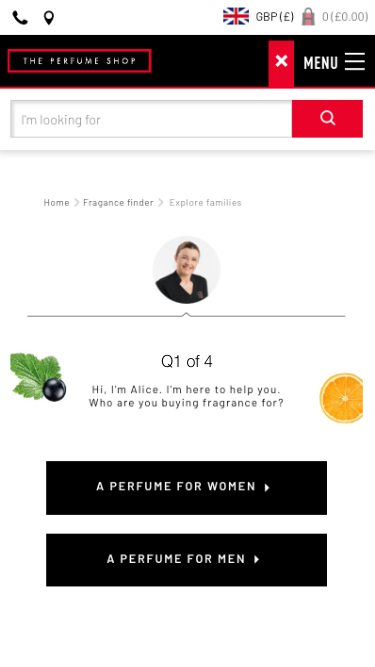
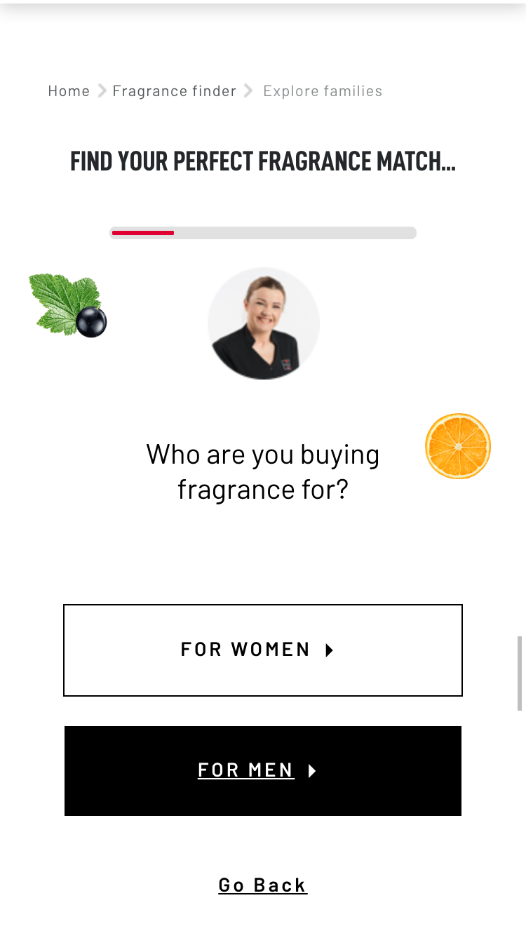
As the number of questions varies depending on which route you take in the quiz we decided V2 is not appropriate. Instead we chose a simple percentage bar (v4) which animates as the user clicks through the quiz questions.
The Results
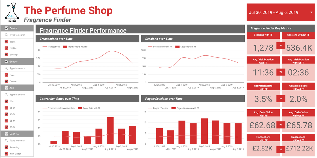
We staggered the changes over 3 weeks and monitored the bounce and conversion rates.
10th July - improve search algorithm to be more commercially focused +1.8%
17th July - add images to search suggestions +0.7%
24th July - add progress bar +0.6%
Overall these changes within the quiz increased Conversion rate from 0.4% to 3.5%!
10th July - improve search algorithm to be more commercially focused +1.8%
17th July - add images to search suggestions +0.7%
24th July - add progress bar +0.6%
Overall these changes within the quiz increased Conversion rate from 0.4% to 3.5%!
AB Testing
To improve the landing page, we decided to run a series of AB tests.
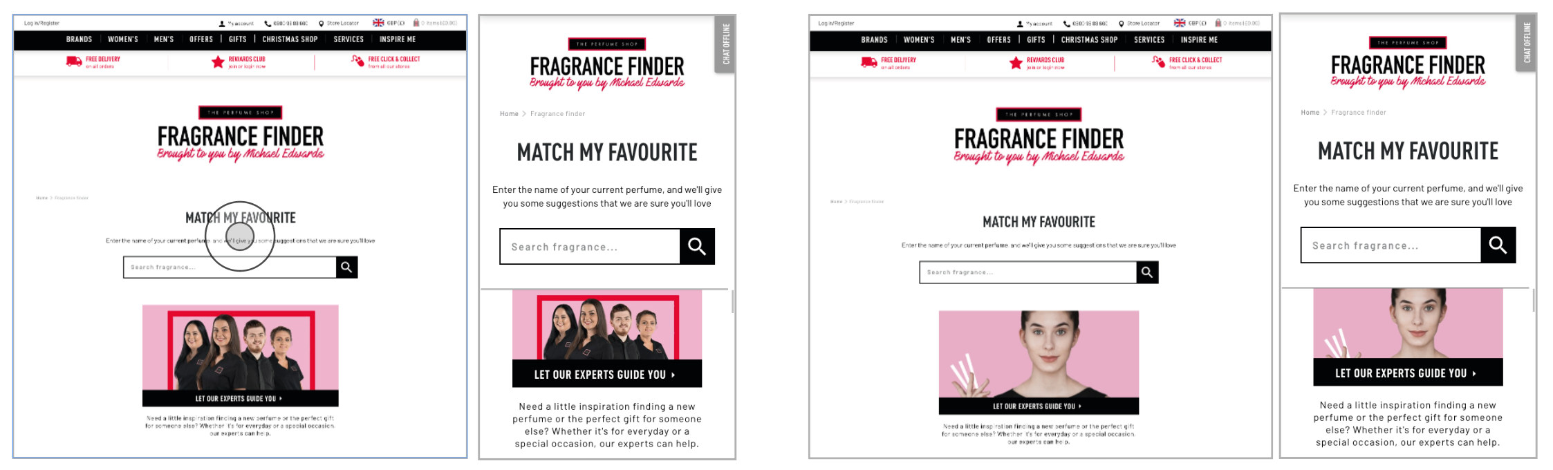
I conducted an A/B Test to improve the homepage.
- I brought both Quiz options above the fold (on mobile)
- I expanded the Match My Favourite search bar out so that user’s can see and interact with it straight away
- I tested 2 different images for ‘Let our experts guide you’ to see if the visuals had a impact. (Model vs TPS Staff group photo)
Initially looking at the results from this test, it seems as though the original is the winner of this test, as the variants show no decrease in bounce rate and a decrease in overall conversion rate. They also saw a drop in session duration and transactions. On desktop, the results show that the Original still performs the best with the highest conversion rate and lowest bounce rate. On mobile, V1 saw the best improvement in KPI’s, reducing bounce rate and increasing conversion rate. It also increased the average order value by nearly 20%! Overall, this would bring the e-commerce conversion rate up on mobile from 2.04% to 2.4%.
As there was no clear winner. We decided to retest with a new design with background colour, new images and still expanding the search box on the Match My Favourite Option. As the FAQs banner was getting a lot of clicks, I chose to open them up to show 7 different FAQ questions.
As there was no clear winner. We decided to retest with a new design with background colour, new images and still expanding the search box on the Match My Favourite Option. As the FAQs banner was getting a lot of clicks, I chose to open them up to show 7 different FAQ questions.
This test ran for 3 weeks and the results were very positive! They show the variant as a clear winner with 96% probability to be best and beat the original. The primary KPI for this test was to reduce bounce rate from this landing page. Overall we saw a 10% drop in bounce rate so we consider this test a success. We also saw an increase in average order value by 7%.
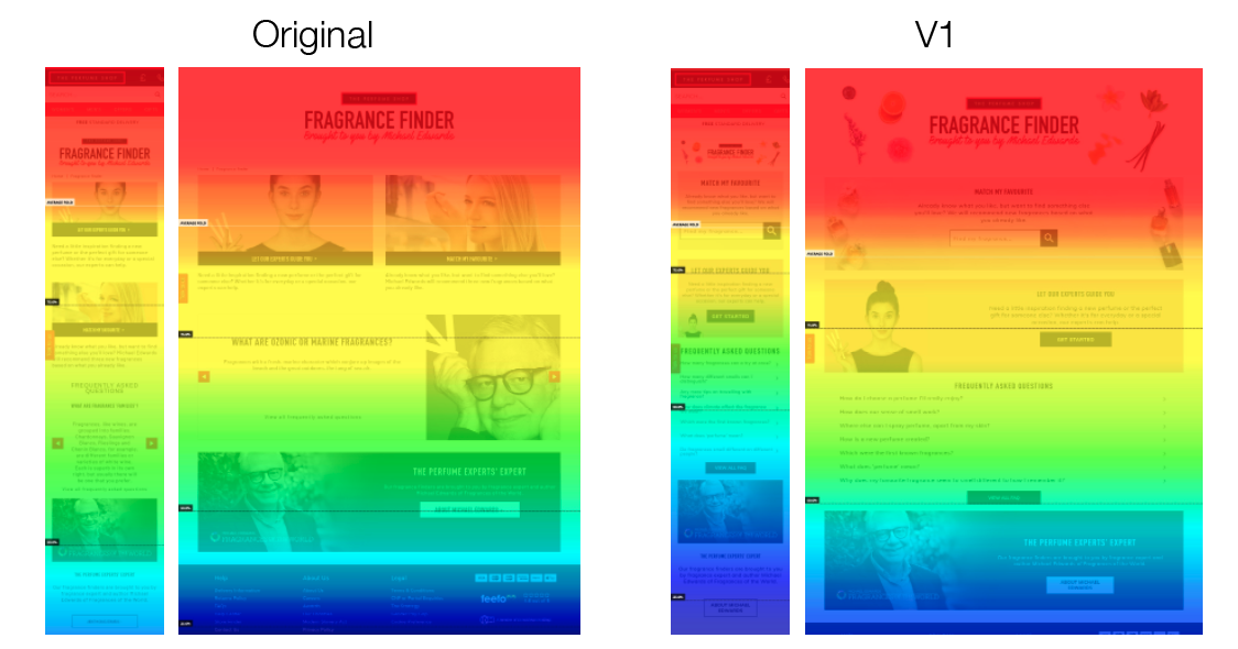
Heatmaps set up on these pages show an increase in visibility for the quiz as the Match My Favourite now falls above the fold. Users scrolled less on the mobile variant 1 but this seems to be as they chose to interact with the search bar rather than carry on scrolling and looking for more content. Less users scrolled to the bottom of the page and below the Michael Edwards banner suggesting they found content above this to interact with. Therefore this new design was raised as a CR and implemented.
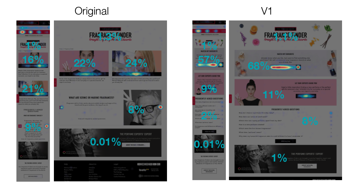
The variant shows 80% of desktop clicks and 66% of mobile taps were visitors interacting with the quiz’s (vs less than 50% for the original). For the variant, 68% of visitors clicked on MMF on desktop and 57% on mobile. The variant design brings the Match My Favourite quiz above the fold on all devices.
AB Test - Results Page
From my research and personal experience using the fragrance finder, I found that the results page was uninspiring and there was no way for the user to choose one particular fragrance to purchase. I wanted to make this page more inspiring and fun, and to imitate a Tinder style gamification, where users can swipe right for fragrances they like the look of, and left for ones they don’t.
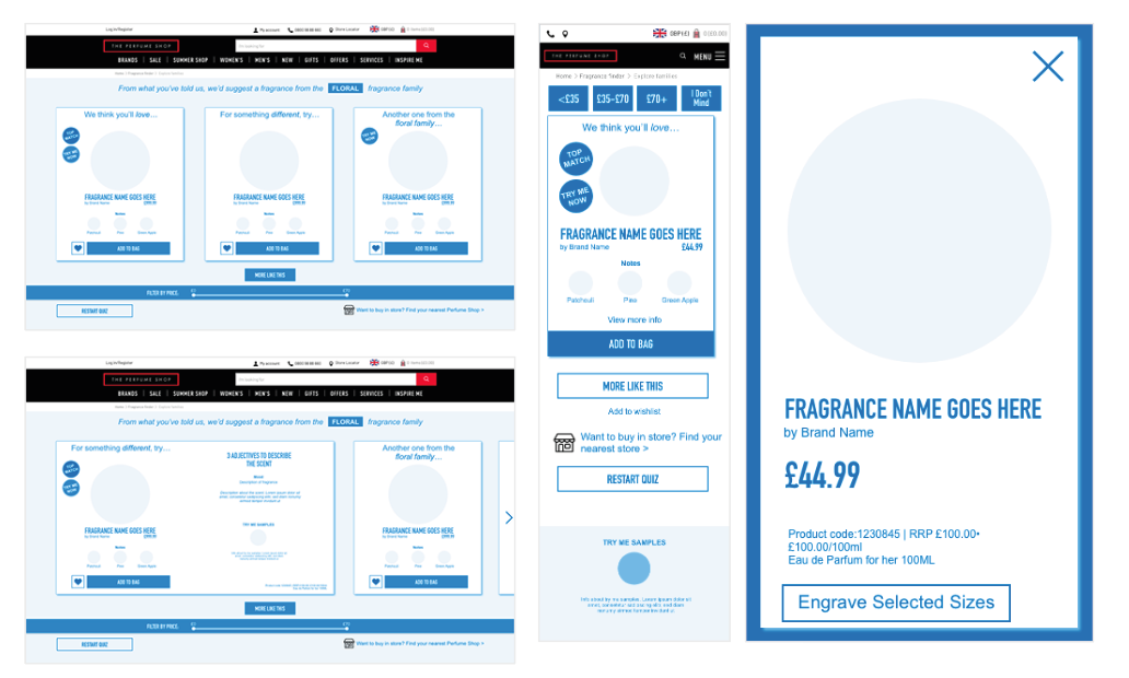
I created low fidelity wireframes and prototypes in XD. I tested these on some colleagues to see if the swiping motion and buttons were all easy to use. I made some small amends before passing the wireframes to design to be built.
We set this up as an AB test to compare against the current results page. The initial page was heavy on the vertical scroll, so my design reduces this by stacking the products horizontally instead. I added a price filter so users can refine the results further. I added the visual UI to align with the new redesign. On mobile, I added an element of gamification as users can swipe ‘Tinder style’ through the results.
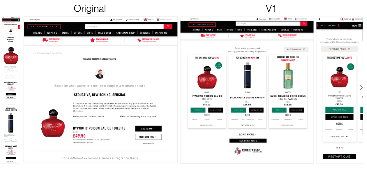
The test ran for 21 days, results show the variant as a clear winner, with an increase in all KPIs. From looking further into analytics, we can see that mobile CR increases from 1.24% to 1.64% and on desktop 2.59% to 2.8%. This was set as a personalisation in Google Optimise and then as a CR.
Next steps...
To improve this project further, I would like to add a real time stock feature. This would enable customer to go to their nearest store if they wanted to try the perfumes before purchase, and improve the O+O journey, I identified 12 different user journeys, based on different locations of the user (at home or in a store). Using geofences, the app can locate the user and base the journey on this - either recommending purchase online or the user to test in a nearby store. This personalisation in journey aims to increase sales, both online and offline.
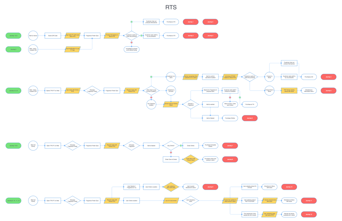
I identified the customer touch points and decision making through this process and generated a user flow. If the user wanted to try the results in store, they would get only stock show in their local store, to avoid the disappointment of not being able to try it and TPS losing a sale.
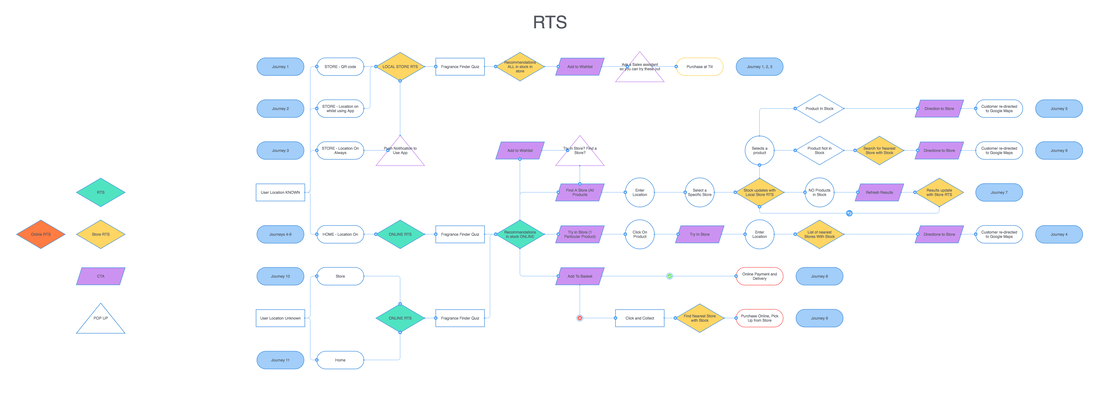
I mocked up the wireframes in XD, using orange on-top of the existing journey to show where the Real Time Stock indicators would be added on each page. The yellow indicated that the user has allowed their location to be shared and the app is using this to process the data.
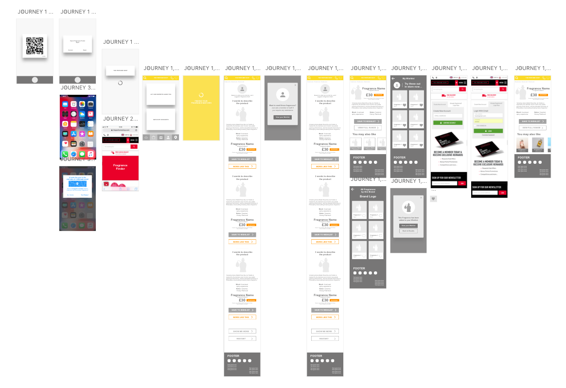
This Real Time Stock feature is currently in development and not yet live.
The fragrance finder is now live at https://www.theperfumeshop.com/fragrance-finder
